Web Design · Digital Storytelling · Automation
Work

A growing portfolio, presented honestly.

These projects show the kind of work Village Flow Studio is here to do: websites that feel like the business behind them, not just pages filling space online.

Each card gives a glimpse of the business, the atmosphere, and the thought process behind the build.

At a glance

What these builds show

How thoughtful page structure, calmer visuals, and better storytelling can change a first impression.

What you will not see

Fluff pieces or filler screenshots. Each example is here because it says something about how the work is meant to feel.

What is still growing

The portfolio is still expanding, but the standard for clarity, tone, and trust is already in place.

Portfolio Layout

A few builds that show how the work is meant to feel.

Some projects are already live, and others are still being documented, but the goal is the same in each one: make the business feel more welcoming, more clear, and more true to itself online.

Landon's Loaves homepage showing the live website design, navigation, and hero section.

Home bakery · Small business
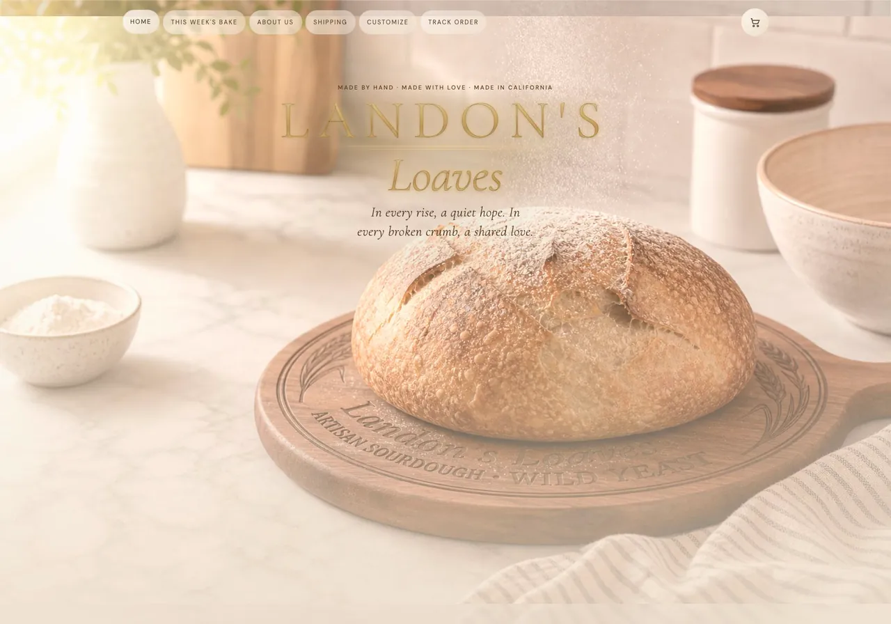
Landon's Loaves

Built for a home bakery with a real story behind it, this site turns a weekly bread release into something warm, memorable, and easy to trust.

Shaped through more than 20 design passes until the look finally felt like the business itself
Built around the owner's story so the color, layout, and product flow all felt personal instead of packaged
Anchored by a custom breadboard brand image that gave the homepage its handmade, inviting tone

This was the first completed Village Flow Studio project and the one that set the standard: listen closely, design with care, and make the owner feel proud of what they're handing people.

The Music Box Tampa homepage showing the live website design, navigation, and lesson-first hero section.

Music education · Small business

Music School Business Site

Created for The Music Box in Tampa, this site was built to feel energetic, welcoming, and clear enough that families know exactly how to take the next step.

A full multi-page structure for lessons, events, show registration, and studio contact paths
A homepage that leads with the studio's energy while still making trial lessons feel easy to book
Program details, local trust signals, and FAQs arranged to help parents and students move forward with confidence

The goal here was to make the studio feel alive online without making the website feel noisy. It needed personality, but it also needed a simple path into the business.

Short-term rental guest guide concept showing a tablet-based stay guide, smart home instructions, and guest experience design.

Short-term rental · Guest experience

Short-Term Rental Home Guide

Designed as a shareable home guide, this kind of site helps guests, house sitters, and pet sitters understand the stay, the routines, and the house itself without a long chain of text messages.

Built on a simple belief: a guest experience deserves more than a laminated instruction sheet on the refrigerator
Smart home instructions, routines, and commands organized so guests and sitters are never left guessing
A calmer way to share local food, things to do, and practical stay information in one place
Built to support the full guest experience beyond what Airbnb or VRBO usually gives an owner

For owners, the real value is simple: it gives them one polished place to hand off the home, the routines, and the local experience without repeating everything over and over.

Consultation

If you want the website to feel more established before the portfolio is even full, the design and the message still have to carry that weight.

A thoughtful first impression, clearer service pages, and a better consultation path can start doing real work now while the project library continues to grow.